TRIO STUDENT SUPPORT SERVICES

INTERNSHIP/ Rebranding / Wayfinding Signage system

THE BRIEF

TRIO is a federally funded program that supports first-generation and low-income college students. To better connect with its community, the brand needed a more modern look, clearer messaging, and more engaging ways to reach students.

THE OBJECTIVE

Refresh TRIO’s identity and communication tools to better resonate with students, build recognition on campus, and increase participation in TRIO’s services and events.

DESIGN STRATEGY

I focused on creating a bold and approachable brand system centered around accessibility and empowerment, using rounded corners and soft shapes to communicate warmth and openness.

typography & color palette

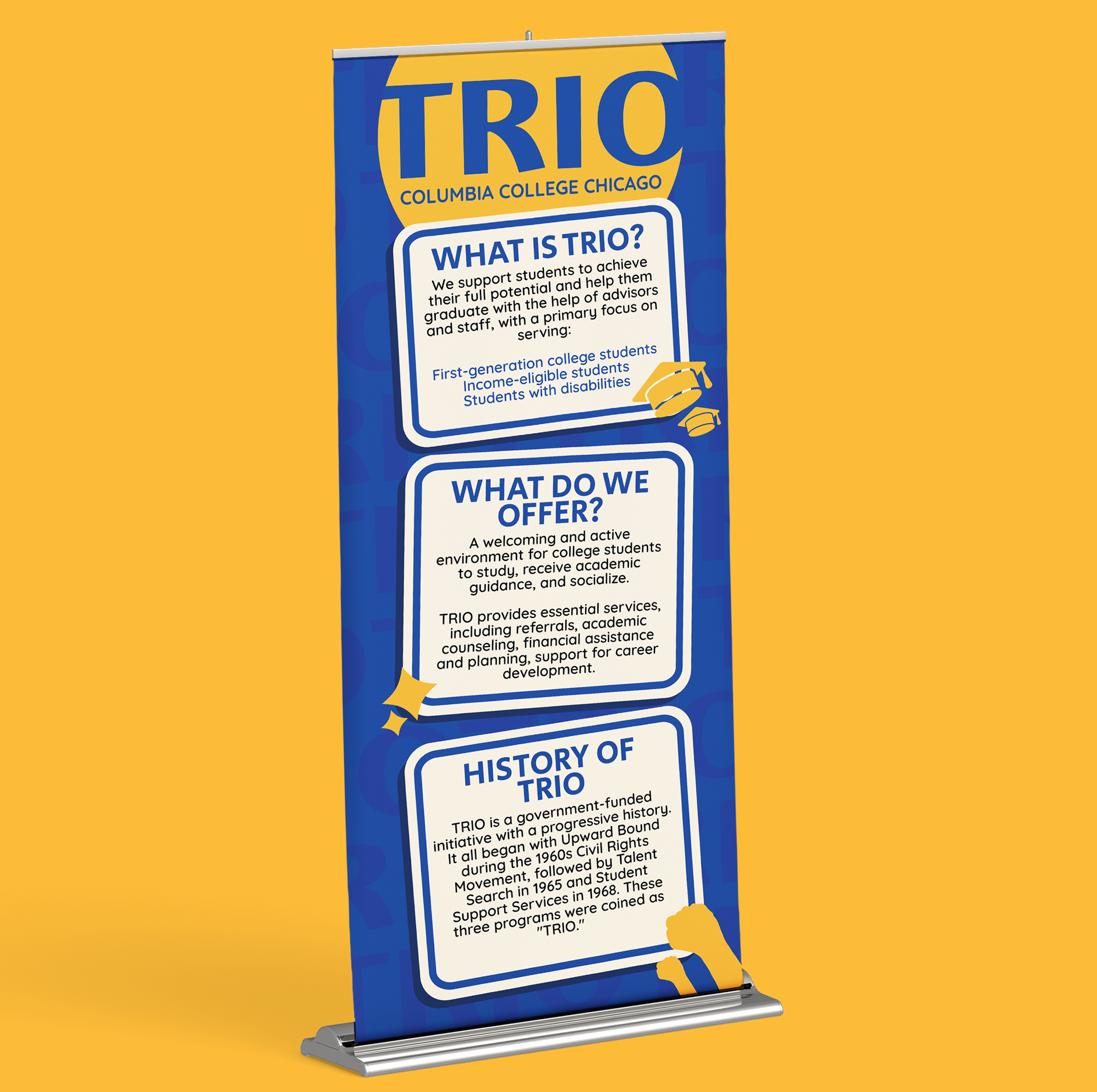
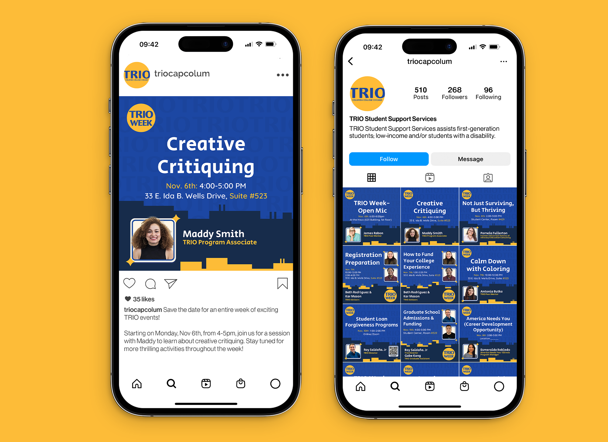
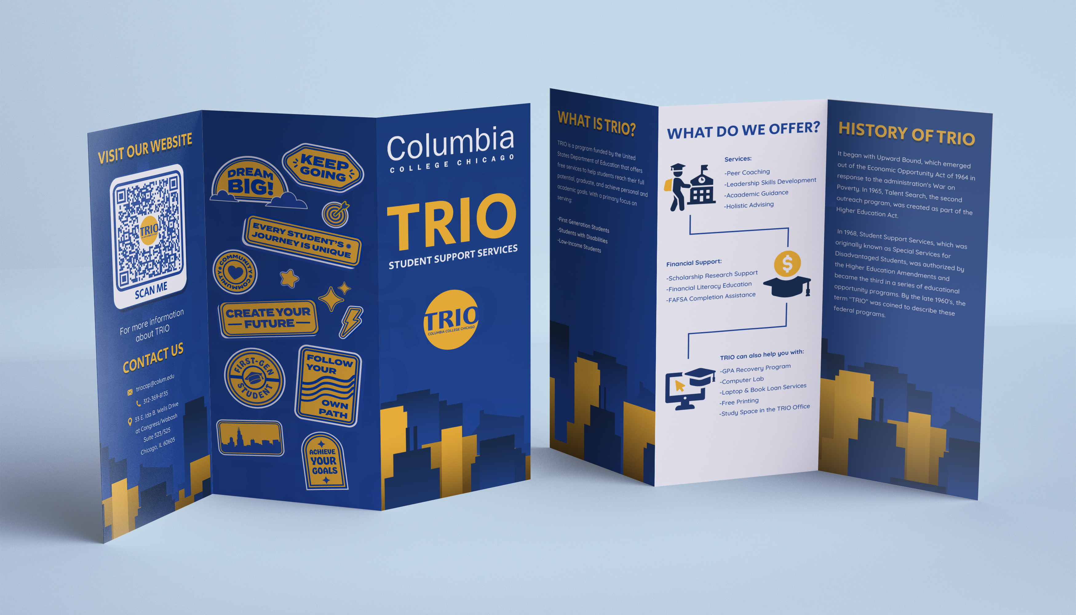
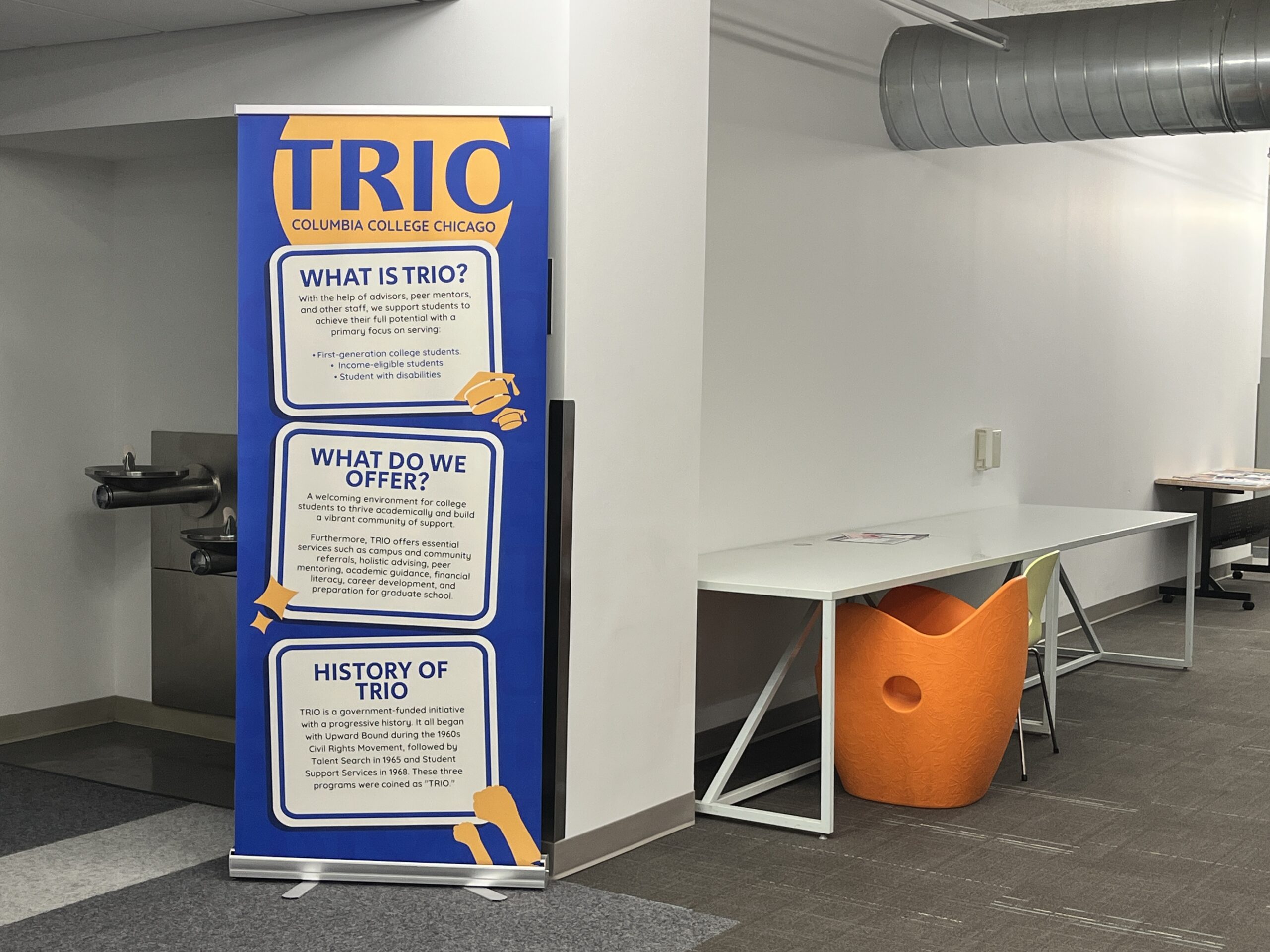
The body copy uses the font “Quicksand” for its soft, rounded forms, reinforcing a friendly and approachable tone. For headlines, “Secular One” was chosen for its sharper edges and bold presence, reflecting the strength and advocacy at the core of TRIO’s mission.

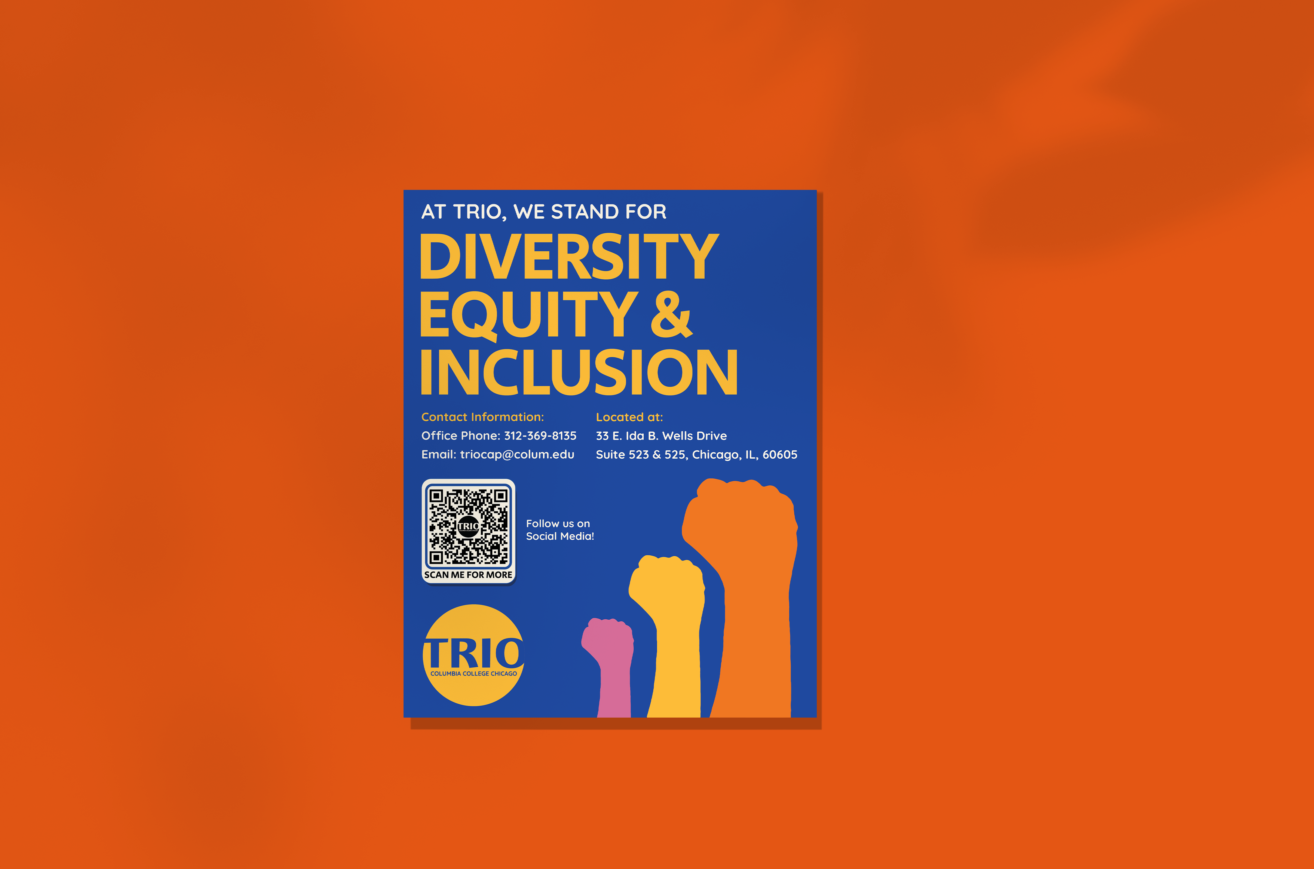
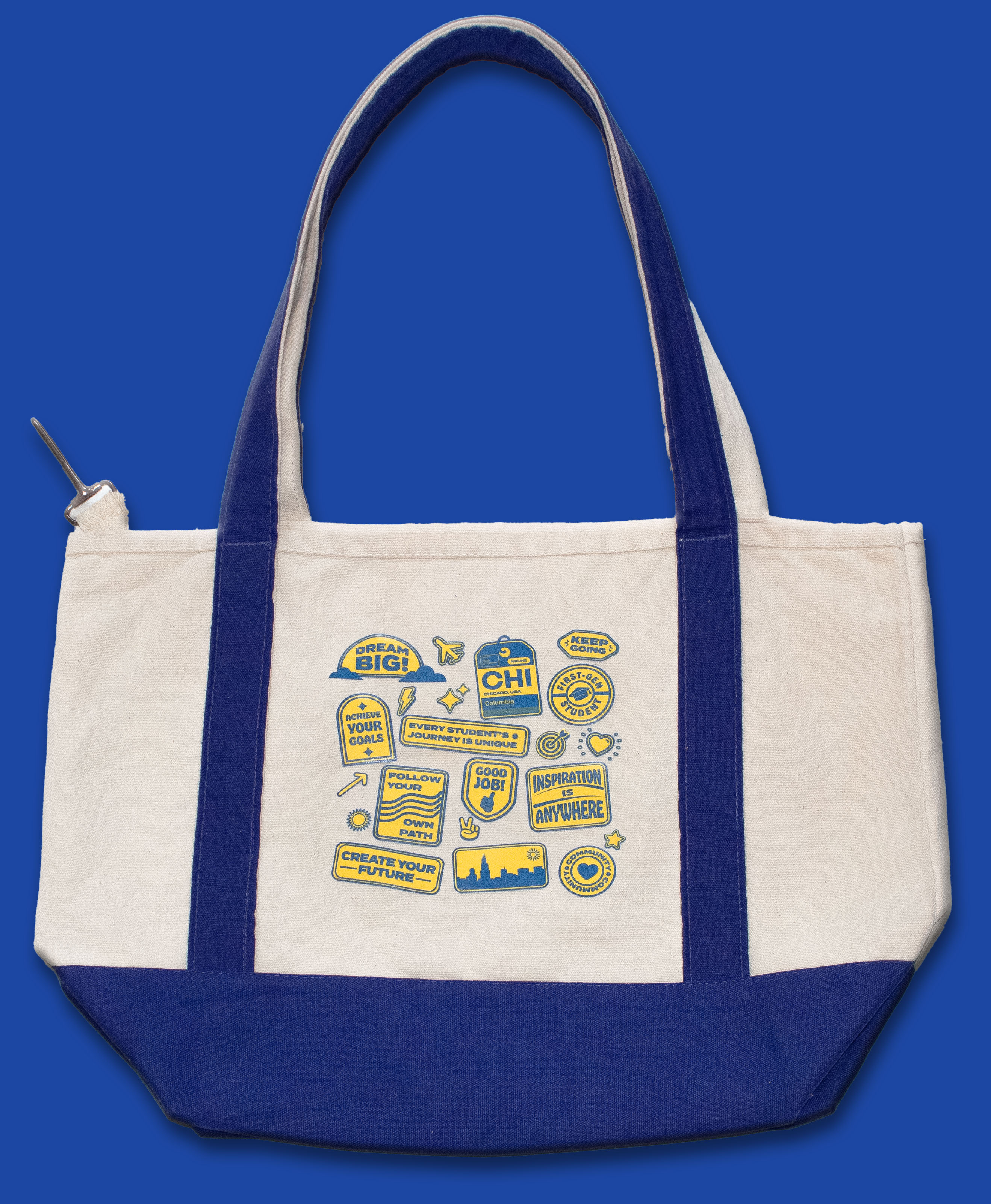
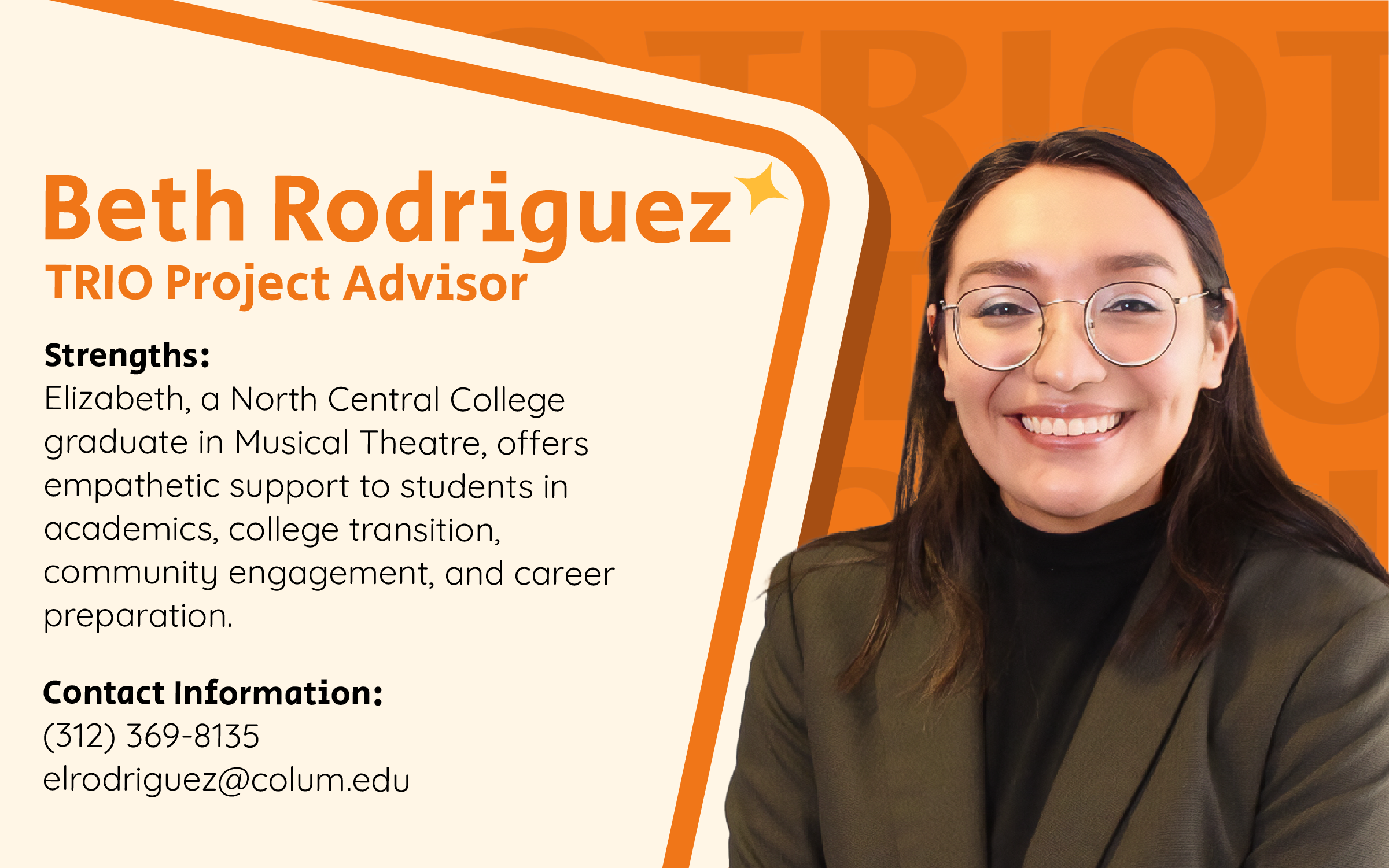
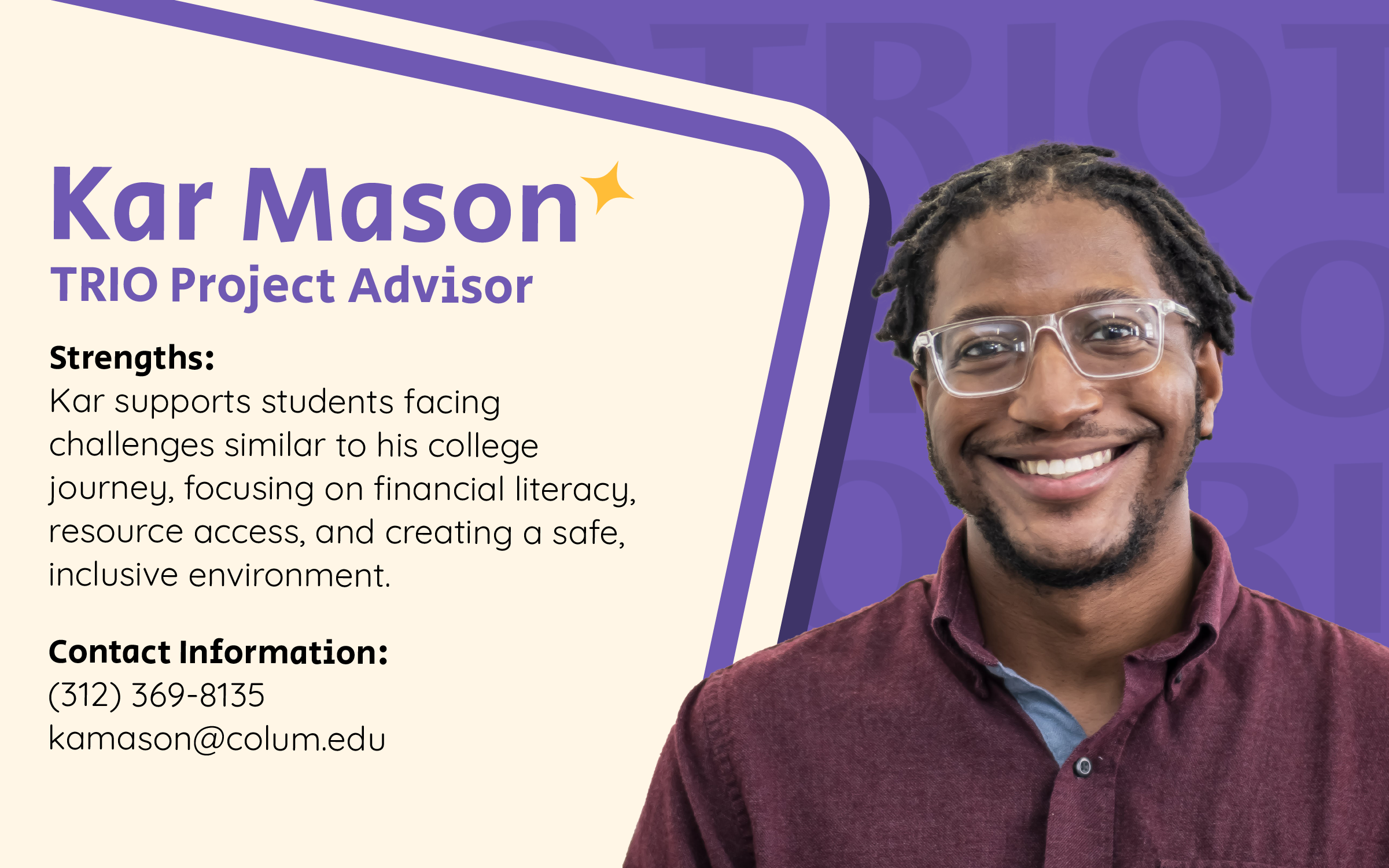
The color palette takes inspiration from well-known nonprofit organizations like the Human Rights Campaign (blue and yellow), while complementary tones like purple, pink, and orange are used to bring warmth and individuality to elements such as staff profile cards.